I’ve fallen a bit behind in posting the weekly spreads for the 52 Planners in 52 Weeks challenge (sorry guys!) For week 3 I used the vertical Plum Paper Planner.
I’d used the vertical Erin Condren planner before (because that’s what everyone else seemed to be using) but it just wasn’t working for me. However, I decided to give the vertical planning style another go since the Plum Paper vertical had a couple of key differences to the vertical Erin Condren.
Some of the differences between the vertical Erin Condren and the Plum Paper:
- The paper of the Plum Paper planners feels SO NICE – there’s something about it that’s so smooth and easy to write on – the paper quality feels better than the Erin Condren. This week I used my favorite rainbow pens, the PaperMate Inkjoy gel. They’re a bit pricey but the ink colors are so pretty!
- The colors of the planner spreads are nicer in the Plum Paper. I HATED the colors of the 2016 version of the Erin Condren colorful life planner. Color schemes like yellow and green? Yuck! I’m yet to meet someone that actually likes those 2 colors together. There are so many nicer colors to combine such as green and pink, pink and blue, green and blue etc. Anyway, I much prefer the simplicity of the Plum Paper’s colors where each month has just one color for the tabs and title/header boxes with a secondary color of light grey color for the writing areas.
- The simple color scheme of the Plum Paper planners means you could use any stickers without feeling like it needs to coordinate with the monthly colors in order for your planner to look good.
- Plum Paper planner has 1 column for each day that you can do whatever you want with – it’s an open ended planning space rather than split into 3 sections per day
- The lined writing space of the Plum Paper planner is great if you have messy hand-writing like I do and are prone to writing on an angle. The height of the box/writing space was just right 🙂
- Plum Paper planner has a bottom list section where you could put your top 3, meal plans, social media posting, things you need to remember or anything else you like! Whereas the Erin Condren has 3 lines underneath the daily planning columns
- Both planners have title/header boxes for each day – the vertical Erin Condren has three per day, while the Plum Paper planner only has 1, plus the checklist box at the bottom
- The sidebar of the Erin Condren has a lined writing space while the Plum Paper has a checklist and blank unlined note taking space. I use the sidebar for weekly tasks that it doesn’t matter when it needs to get done just that it does get done such as paying bills. I prefer a checklist in the sidebar as I tend to add a checkbox for everything I add to my planner anyway
Related Post: Plum Paper Planners Haul & Review (better than the Erin Condren?)
Cons of the Plum Paper Planner
- Some of the colors of the Plum Paper planner are dark such as January (see below) I didn’t write anything in the top title box as I didn’t think black pen (or any color other than white) would be legible. If anyone has a favorite white pen they love, please comment below – I’m on the hunt for one!
- Each week of the Plum Paper planner has a monthly dates at at a glance/snapshot in the top left corner. To be honest, I wasn’t really sure what to do with this space. I ended up just circling the current week. I did think about using it to track days I posted on Instagram (follow me if you haven’t already!) as I’m quite bad at posting regularly on there. I also thought about using it to track my monthly cycle.
Planning with the Plum Paper Vertical Planner
Start of the Week
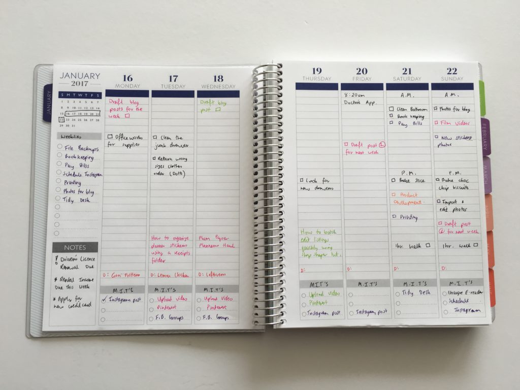
End of the Week
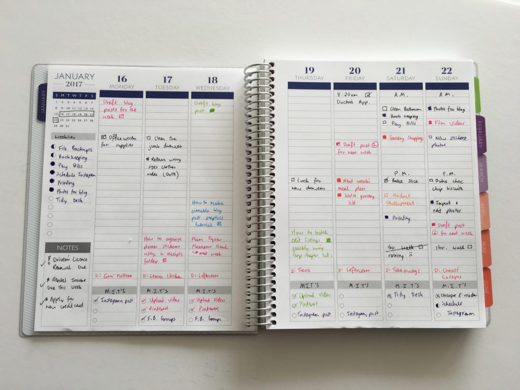
How I approached planning this week
- I don’t feel like I utilised the space in this planner as much as I could have. I was going to allocate sections with header stickers or by shading in some of the boxes to divide up the columns but I wasn’t sure how much room I would need for each category that I plan. If I used this layout again I’d have a better idea and it hopefully wouldn’t look as messy!
- I turned the bottom checklist into a M.I.T (Most important tasks) list but it ended up being more of a social media tracking section.
- I split the weekend into AM and PM. Because I work a full time day job during the week in addition to this blog and my Etsy shop, I didn’t feel the need to split Monday to Friday into AM and PM. Because I’m at work all day, the days of the week ended up looking a bit bare. I’m thinking about designing a printable for use in one of the later weeks of this challenge, that has a smaller daily section for Monday to Friday and much more room to plan on the weekend
- I’ve used various ‘codes’ over the years of using planners. The half shaded circle means that task was start but not completed (i.e. work in progress). I used an exclamation mark to highlight that I needed to renew my driver’s licence. I normally use a mini sticker with an exclamation mark. Cross out for things that didn’t end up happening. I’ll be sharing some of the other codes I use in an upcoming post. Make sure you’ve subscribed if you want to be notified when that post is published.
- Orange for products
- Green for business related to do’s such as social media
- Purple for personal tasks such as bill paying
- Pink for blogging
- Red ended up being meal planning
Read more about how to color-code your planner (so you’ll actually use it effectively) and my favorite color coding planner supplies for less than $5
I remembered one of the main reasons why I didn’t like using the vertical Erin Condren life planner – the vertical columns are thin – which means each task can extend over 3 lines. Because I didn’t want my weekly spread to be cluttered with a bunch of text, I tried to leave a space in between each task (especially tasks that extended over multiple lines). I do feel that this ends up wasting a bit of space and I don’t like that your eyes have to keep flicking back and forth from left to write just to read what that task is. I think I prefer horizontal planners.
Plum Paper vertical planner better than the Erin Condren?
The Plum Paper planner is very similar to the Erin Condren planners. However, the key differences noted above mainly being the lined writing space, paper that feels like it’s better quality and nicer colors are a win in my book. I think I’m a bit bored of seeing dozens of posts with people using the vertical Erin Condren planner all over Instagram. Their layouts always look the same – I’m ready to discover some new planners, hence why I decided to do this challenge!
Want to follow along and join in the 52 planners in 52 weeks challenge? Read the previous week’s posts (and click here to download some free printables of the layouts I used)
Related Posts
- How to keep track of spending using stickers and blank notes pages of your planner
- Best pens for writing on washi tape
- How to make a DIY Erin Condren Planner Cover for less than $2 (plus free printable cover)
- How to organize and color code your notes for school, college or university
- MAMBI Happy Planner Recipe Organizer Review
- How to organize small planner stickers using a reciepts folder
Disclaimer: If you purchase something from Plum Paper using my referral link I’ll receive a small commission (at no extra cost to you!) I only recommend products I would recommend even if I wasn’t receiving compensation for referring you.
Leave a Reply