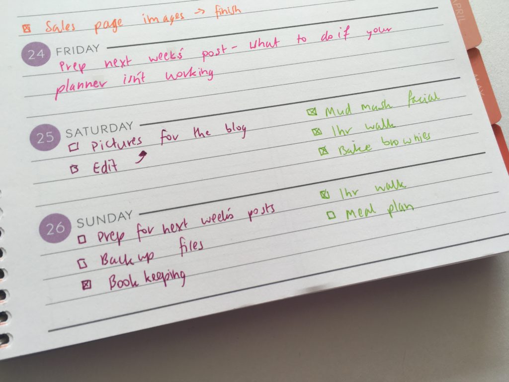
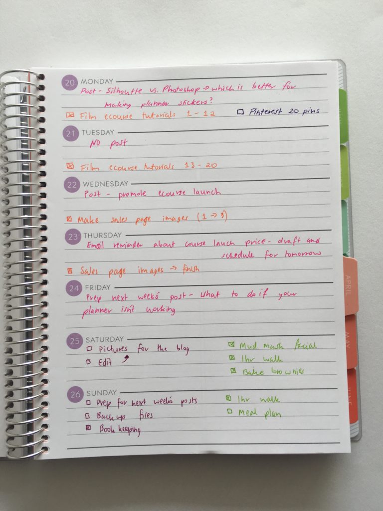
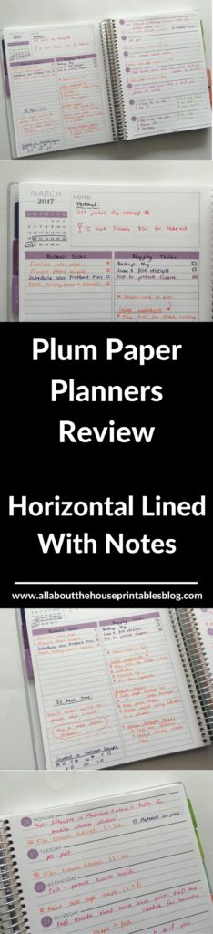
For week 12 of the 52 Planners in 52 Weeks challenge I used the Plum Paper horizontal lined layout on the right side of the 2 page weekly spread, with the checklist and notes box on the left page. This planner layout is one that I think doesn’t get enough promotion – everyone seems to use either vertical or horizontal styles. As I’m more of a task focused planner rather than planner decorating, I was keen to try out this layout.
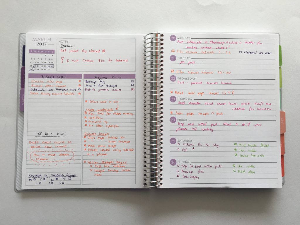
I switched up my color code slightly this week:
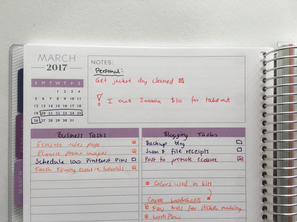
- Red = urgent / don’t forget tasks
- Pink = blog posts
- Orange = ecourse planning
- Purple = social media & behind the scenes
- Green = Personal
Pros of this layout
- If you don’t have a lot of tasks that need to be done on certain days this would be an ideal layout for you. If like me, you tend to just have a list of things that need to get done and it doesn’t really matter when you do it so long as it all get’s done
- This planner has a different layout to most planners that tend to have the days of the week spread across 2 pages. I like that the weekly plan is on 1 page only so you could fold the notebook back on itself to only view one page at a time, while still being able to see your plans for the entire week

- Horizontal – lots of room to write each task. One of the reasons I don’t like using vertical planners is because the columns are so narrow. Tasks tend to extend over multiple lines with your eyes flicking back and forth all the time
- I like that this layout forces you to be ‘space efficient’ in how you plan and doesn’t leave room for you to waste time writing the same tasks each day
- I liked having the notes box at the start of the week rather than on the bottom right of the page (as it the case with the horizontal Plum Paper, Erin Condren and Happy Planners)
Cons of this layout
- The daily planning space on the right side of the page can be a bit tight at times to try and fit everything in if you have plans, events, bills etc. that need to be done on a specific day.
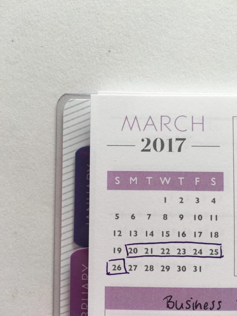
- The dates at a glance mini calendar for the month is a bit of a waste of space – I didn’t refer to it especially when the planner comes with a 2 page calendar for each month, and a dates at a glance calendar for the entire year at the start of the planner. If I were to use this layout again, I’d cover this up with a sticker. I ended up just drawing a box around the current week
Would I use this layout again?
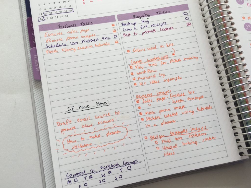
I really liked this layout – I loved that I could separate everything that needed to get done by brain dumping on the left side, then scheduling on the right.
I’d use planner stickers. The no sticker week was quick to setup but the weekly spread ended up looking boring and a bit messy without stickers to break up the text.
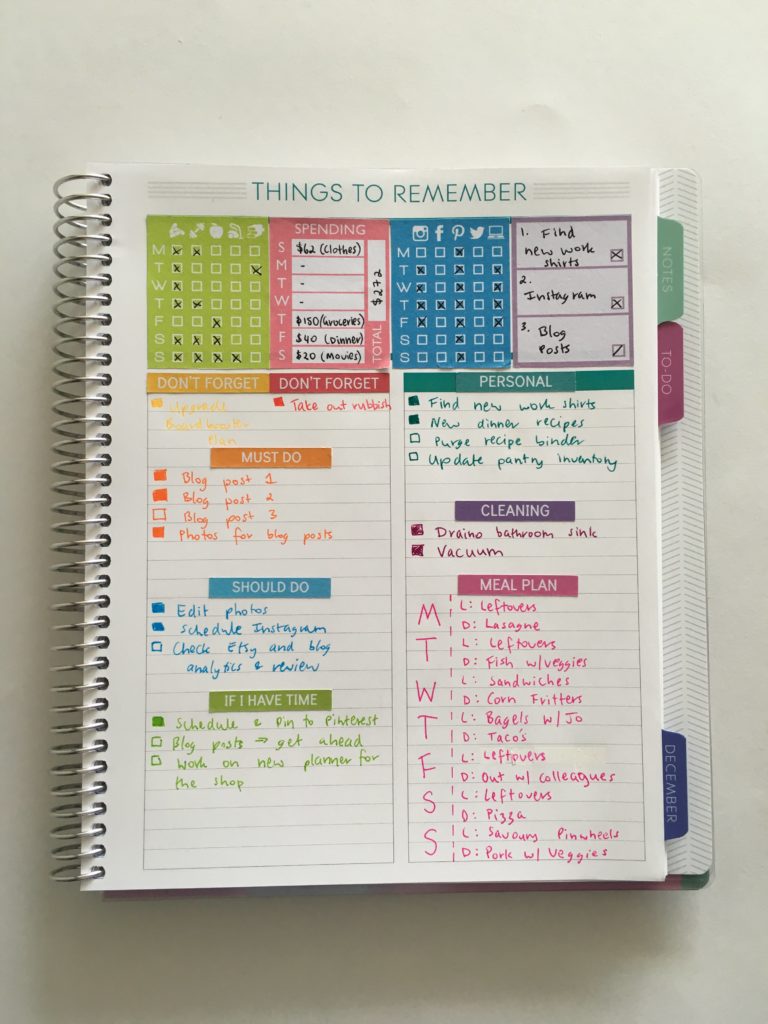
I under-utilized the notes box at the top of the week. I used this for reminders (and wrote in red pen to draw attention to them). I prefer using stickers like I did in week 8 using the Plum Paper Memory Keepers book:
I would instead add weekly routine stickers such as hydrate tracking, social media posting, vitamins etc. – especially since this layout doesn’t leave much room on the daily planning space so if you were to write ‘Pinterest – 20 pins’ each day (as I started to do, before I then realized it would make everything quite crammed), you’ll run out of space quickly.
I also set up a tracker for posting in Facebook groups I belong to – it would’ve saved a lot of space if I’d use a sticker to track this instead.
Related: Why I plan my day using planner stickers (and why you should too!)
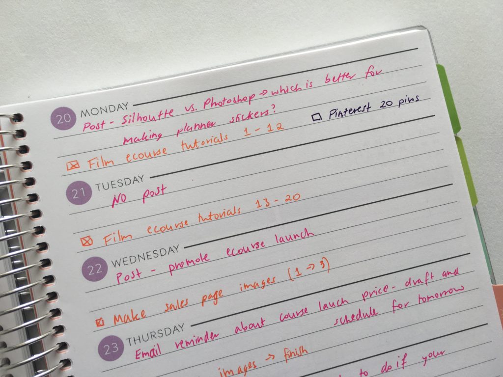
I made sure I noted which tutorials needed to get done and by when, rather than just adding ‘film videos’ to my to do list. I find if I’m vague when writing my to do’s then it gets overwhelming. But if I break things down into bite sized chunks and specifically state what I want to achieve that day, then I’m not frazzled.
I’d probably also divide the list space on the left page into 4 sections using a header sticker as this space ended up being a bit awkward and not well thought out:
Other ways to use this layout:
- Solely for product development – I deliberately chose to use this layout as I was in the middle of creating and launching an ecourse: How to Make Planner Stickers. I love that this planner layout is task focused so I can plan everything that needs to get done on the left side of the spread, then transfer that to each day on the right side of the spread, to work out how I’m going to get it all done
- Journaling- I don’t really journal, I use planners to plan. But if you’re into journaling you could use the left side of the page for to do’s and meal planning, and keep the right side free for daily journaling, gratitude, things that happened that day, favorite memory, things your kid/s said etc.
- Use the left side for weekly tasks and a grocery list, and the right side for meal planning
- Splitting the weekly planning space into 2 to create 2 sections per day
Catch up on past week’s of the challenge:
- Week 1: Using a daily habit/routine tracker to plan your week
- Week 2: Planning using daily checklists
- Week 3: Plum Paper Vertical Planner – Better than the Erin Condren?
- Week 4: Minimalist planning: how to plan your week using a blank notes page and stickers
- Week 5: Planning by category and task, rather than by day
- Week 6: Planning using the Horizontal Erin Condren Life Planner
- Week 7: Pros and cons of using a 1 Page Weekly Planner
- Week 8: Weekly Planning using the Plum Paper Memory Keeper Book
- Week 9: Customising the Erin Condren hourly planner for task based planning
- Week 10: Minimalist 1 page planning using washi tape
- Week 11: Digital planning using Trello
Liked this post? Pin it!
Disclaimer: If you purchase something from Plum Paper using my referral link I’ll receive a small commission (at no extra cost to you!) I only recommend products I would recommend even if I wasn’t receiving compensation for referring you.
Leave a Reply